How Do You Make a Tier List People Can Read?
Learn how to choose one ranking rule, add the right items, use clear tier labels, settle close calls, and export a tier list that reads well.
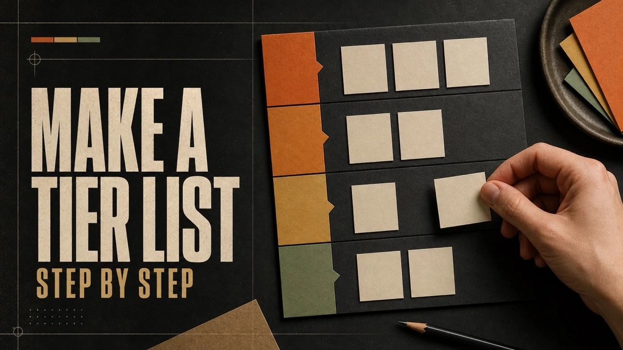
A tier list turns a group of comparable items into labeled rows. The format looks simple, but the finished board only makes sense when the title, ranking rule, labels, and item choices all point to the same question.
The hardest part usually comes in the middle. Obvious favorites reach the top quickly, and clear weak choices fall to the bottom. Similar items need a fair comparison before they can be separated.
A good process solves that problem. You define the rule first, collect the complete item set, place the easy choices, compare the close ones, and check the board at the size people will see after download.
How do you make a tier list?
Choose one focused topic and decide what a higher tier means. Add every item to an unranked group, place the obvious top and bottom choices, then compare nearby items. Rename the rows when letter grades feel unclear. Check the title, labels, image crops, and contrast before downloading the finished board.
Which ranking question should you choose?
The ranking question is the rule applied to every item. A character tier list might compare competitive strength, ease of use, visual design, or personal preference. Those questions can produce very different results, so one board should answer only one.
Put the standard in the title when the topic could be read several ways. “Fighting game characters ranked by beginner value” tells readers more than “Character tier list.” That added phrase also keeps your own choices steady when two items are close.
A narrow question gives the list useful limits. “Best films” can mix genres, decades, budgets, and goals. “Animated films we watched this year ranked by rewatch value” creates a clear group and a clear test.
Which items belong on the board?
Add the complete comparison set before you start sorting. Seeing every choice in the unranked area makes missing entries, duplicates, and items outside the topic easier to notice. It also prevents memory from favoring the first few choices.
Comparable items should share the same basic role. A weapon list becomes confusing if it mixes main weapons, temporary boosts, and cosmetic skins. Separate those groups or state a rule that makes the comparison fair.
Text items work well for recognizable names and abstract ideas. Images help when faces, products, maps, or album covers are faster to recognize visually. A mixed board is fine when every tile stays readable at the same size.
Should you use S, A, B, C, and D tiers?
The standard letter scale is useful when your readers already understand it. S marks the small top group, A holds excellent choices, B covers good choices, C is the middle, and D marks the weakest group. Some lists add F for a separate failing row.
Custom labels work better when letters hide the real decision. A snack list might use “Buy every time,” “Good choice,” “Only on sale,” and “Leave it.” Those labels explain the result without asking readers to translate a grade.
Keep labels short. Long phrases squeeze the tier heading and leave less room for item tiles. If a label needs a full sentence, move that detail into the title or the text shared beside the finished image.
Which choices should you rank first?
Start with the clearest top and bottom choices. These placements create reference points for the rest of the board. A strong item can then be compared with the current top group, while a weak item can be tested against the bottom row.
Move through the board in small groups after those anchors are set. Ranking five similar items together is easier than jumping between unrelated choices. The groups can be based on role, release, category, or any other trait that supports a fair comparison.
An empty tier is allowed. If every choice is at least good, a D row can stay empty or be removed. Forcing an item into a lower row only to fill the board weakens the ranking rule.
How do you settle close calls?
Compare two nearby items under the exact standard in the title. Ask which one serves that goal better and name the reason. If neither choice has a clear advantage, place them in the same tier.
Row order shows broad groups, but item order inside a row can carry another message. Decide whether the left side is stronger than the right. If internal order does not matter, explain that when sharing a list likely to start a detailed debate.
Ties are useful when the evidence or preference is truly equal. A tier list groups similar choices, so it does not need to force a strict first-through-last order. That difference is one reason the format can communicate judgment better than a numbered list.
How should you design the tier list?
The board needs enough contrast for every label and tile. Dark themes suit bright artwork, while light themes can make dark logos and text items easier to read. Check both if the item images use mixed colors.
Tier colors should remain distinct, but color cannot carry all the meaning. The S, A, B, C, and D labels still identify each row for readers who cannot separate certain colors. Custom words add even more context.
Image borders help pale images stay visible against a pale board. A background image should be quiet enough that rows remain the main focus. If the background competes with item tiles, use a solid color or choose artwork with fewer details.
What should the title and logo explain?
The title should name both the item group and the ranking rule. “Coffee drinks ranked by value” is short, specific, and readable. A date belongs in the title only when the subject can change, such as a competitive game after a balance update.
A logo can identify a series, event, channel, or project, but it should not overpower the list. Use a simple image with transparent or clean edges. The board should still make sense when the logo is hidden.
Watermark and copyright lines are optional. They can identify a public graphic, but heavy repeated text can cover the items people came to see. Keep attribution short and preview it before the final download.
Which mistakes make a tier list hard to read?
- Mixed ranking rules. One item moves up for power while another moves up for design.
- An unclear title. Readers can see the subject but cannot tell what “best” means.
- Too many top picks. A crowded S tier stops identifying the real leaders.
- Tiny or inconsistent tiles. Important faces, names, or product details disappear after export.
- Unexplained custom labels. A joke row can be fun, but the order still needs to be clear.
- Missing items. A visible gap can distract from every decision that was included.
How do you make a tier list on a phone?
A touch editor needs a selection method because long dragging can be awkward on a small screen. In the RespawnGuide tier maker, tap an item once, then tap the destination row. The selected item receives a visible border until the move is complete.
Use short text labels and review the board in landscape orientation when several item tiles sit in one row. The exported file keeps the full board width even when the editor needs horizontal scrolling on the phone.
When is the tier list ready to download?
The list is ready when a new reader can identify the topic, understand the scale, and recognize the items without hearing the original discussion. Open Presentation view for one final check, then download a PNG for social sharing or a PDF for a document.
If one choice still feels difficult to explain, return to the ranking question. A clear reason should support every placement, even when the final result is based on personal taste.